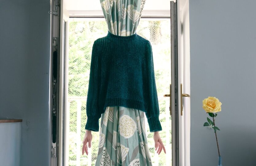
Abstract photography asks you to throw away the “rulebook” and dip into raw, creative expression to show only what a scene makes you feel, whether that is ICM blur, a repeating texture, or a familiar shape dissolved into something unrecognizable, this theme forces you to let go of logic and trust your intuition. The five photos below stood out for exactly that reason, and I hope they remind you that the feeling matters more than the facts.
Browse the full Week 31 Album on 52Frames →
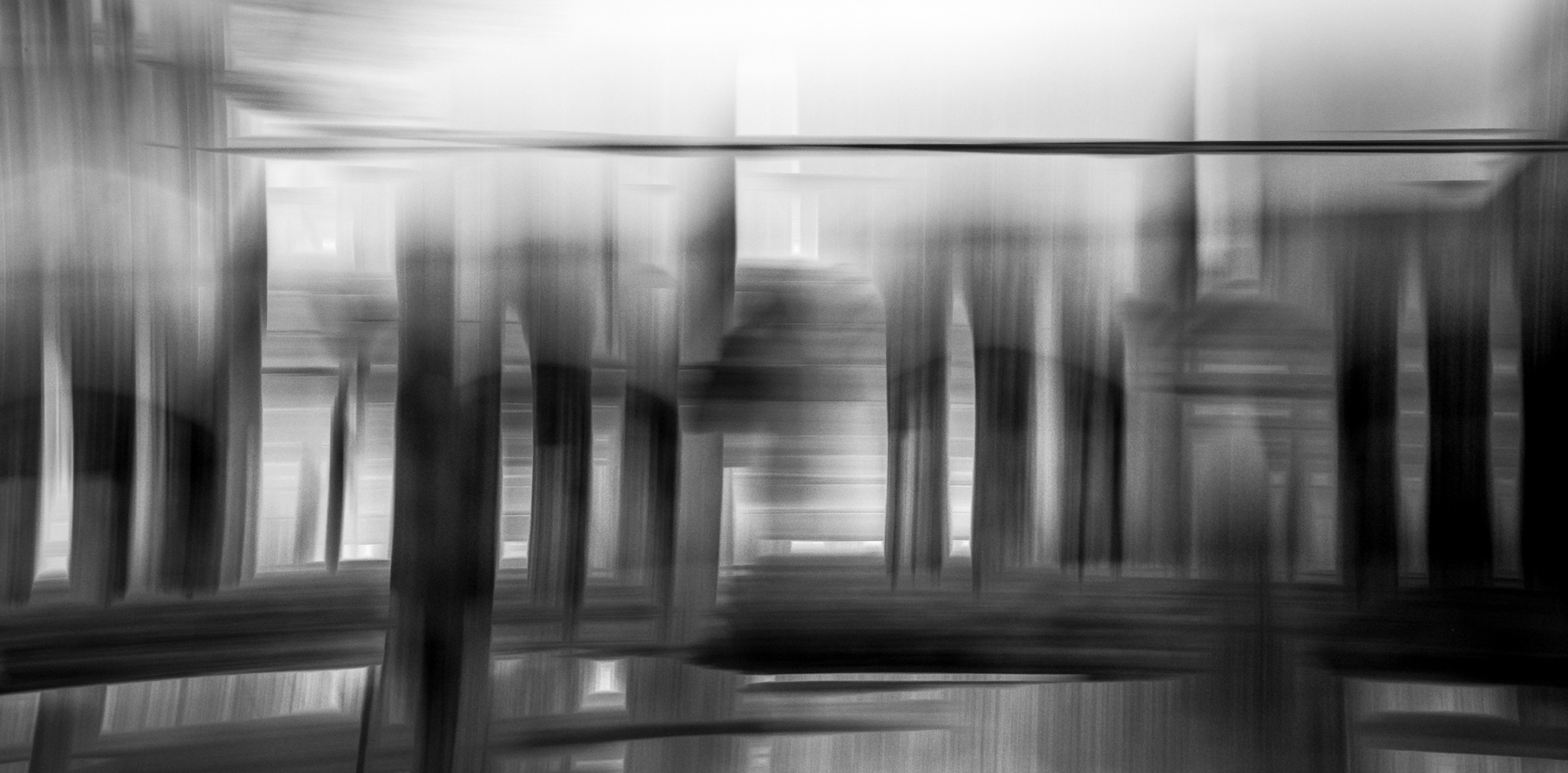
“Architectural Basket Weave”
Why I liked it: This is abstract at its finest. What looks like broad brush strokes or digital manipulation is simply merging two of one of photography’s oldest tricks: intentional movement and multiple exposure. The final result of Sara’s masterpiece is an absolutely beautiful abstract photo
Exif: Olympus E-M1 Mark II · Olympus 12-100mm f/4.0 Pro @20mm · 1/10 · f/20 · ISO 50
Tags: #architecture
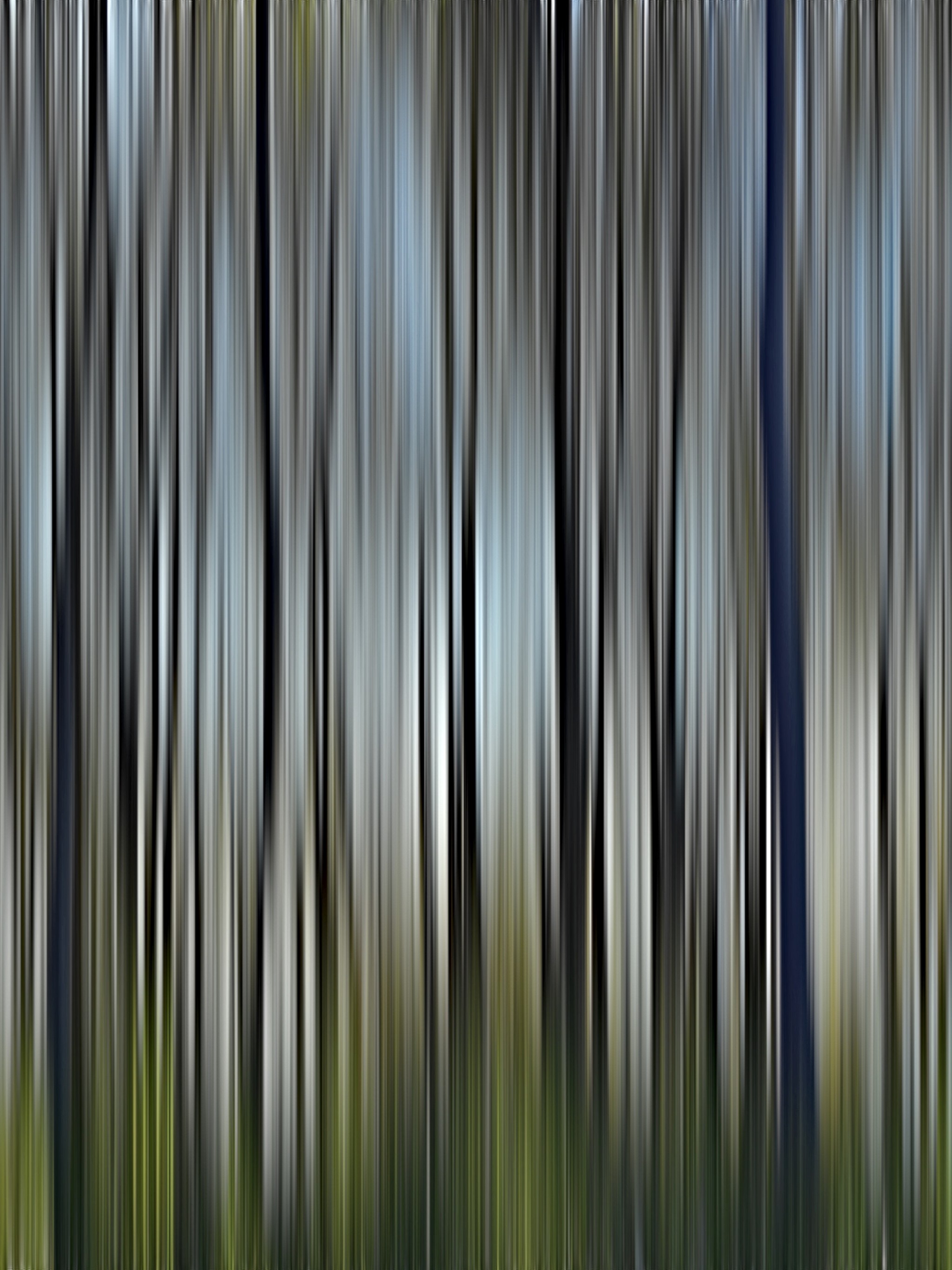
“Trees”
Why I liked it: The best example of abstract, in my opinion, is where you are showing some form, shape, light, and color to evoke an emotion in the viewer. Even if they can’t see the detail, Julie captured some trees with her phone and aggressively edited to peel away all detail but somehow it maintains the feeling of being in nature on a cool winter’s day.
Exif: Apple 17 PRO · @24mm · 1/1000 · f/1.8 · ISO 100
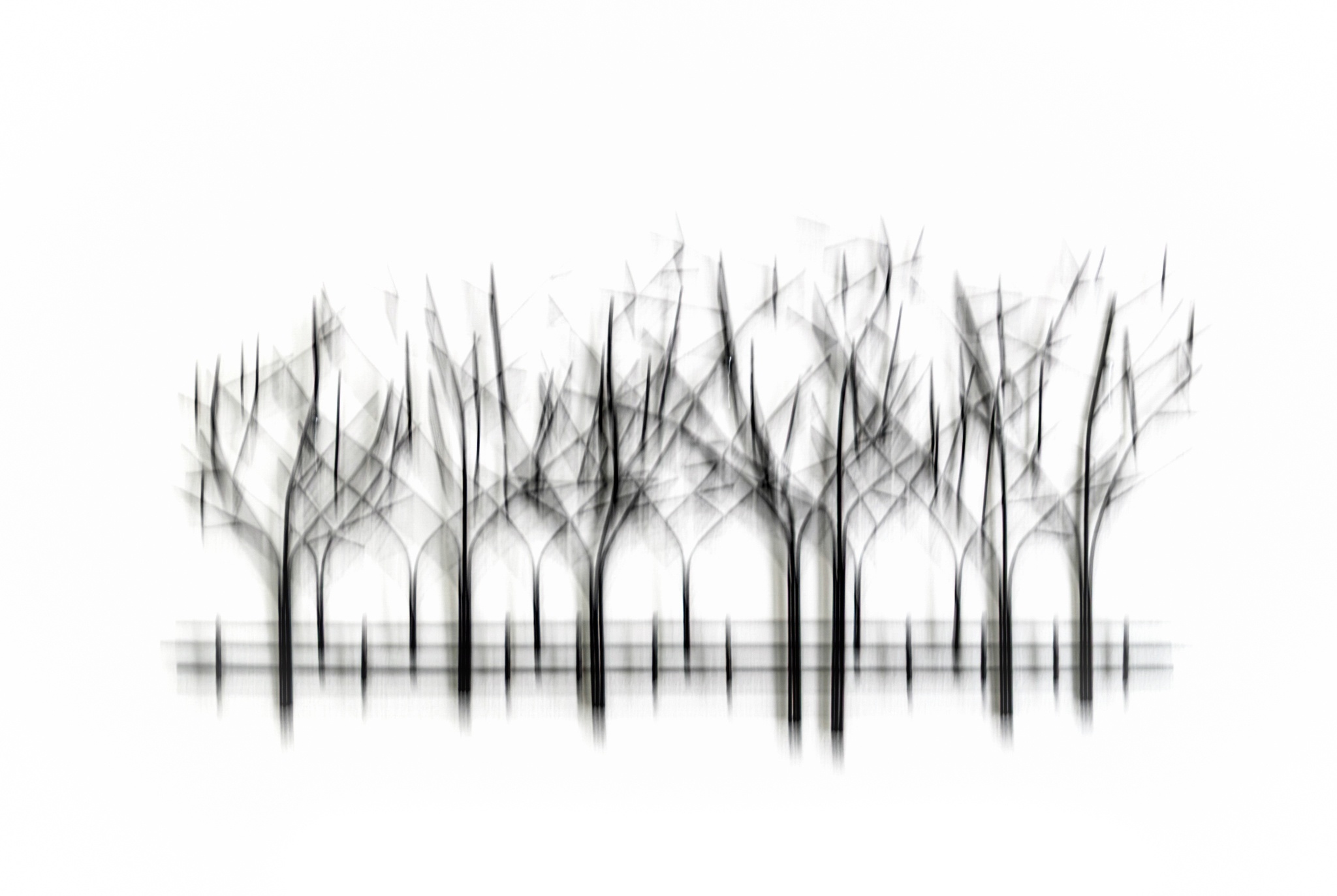
“Trees”
Why I liked it: Terri’s photo is a shining example of how you can take the ordinary and make it special. She captured this beautiful minimalistic piece that hangs on her wall but motivated it with emotion and a high key processing that makes it look like a mix of real world and fantasy.
Exif: Canon EOS 90D · Tamron 18-400mm f/3.5-6.3 @44mm · 1/8 · f/5.6 · ISO 200
Tags: #highkey #icm #blackandwhite #pnwframers #terrianderson #imagebyterri
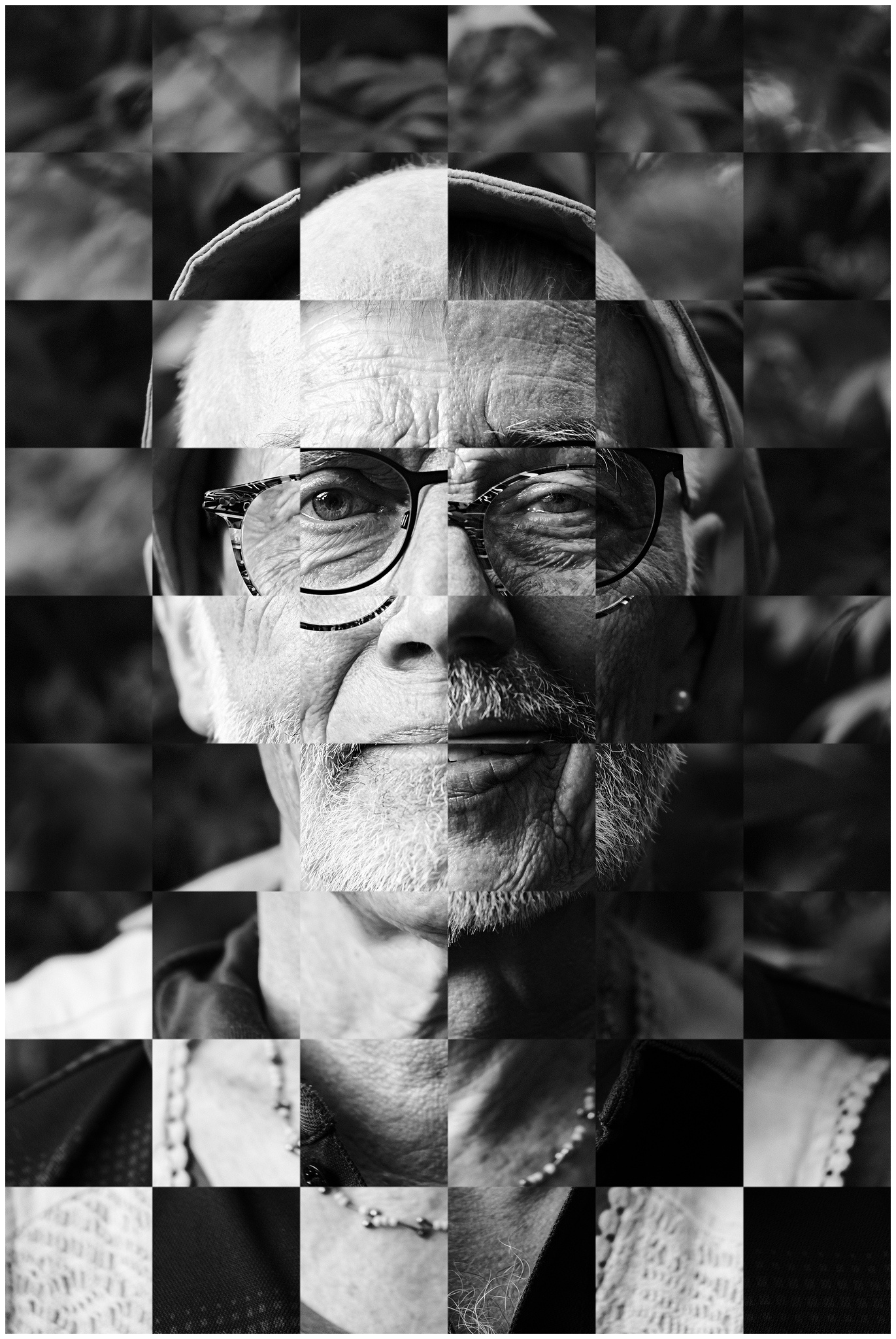
“Squares of Parents”
Why I liked it: Tim made it seem from his caption text that this was just a simple idea but the execution of this photo is an absolute masterpiece. Taking two separate portraits of each of his parents, he flipped back and forth in the edit with a checkerboard pattern and lined it up so perfectly you can’t help but stop to take a longer look to appreciate it.
Exif: Fujifilm X-T50 · Fujifilm 50mm f/2 @50mm · 1/400 · f/2 · ISO 250
Tags: #europeanframers #germanframers #52fuji #bts #blackandwhite #composite #portrait #family #parents #chess
Genre: Composite Edit, Black & White, Portrait/Self-Portrait
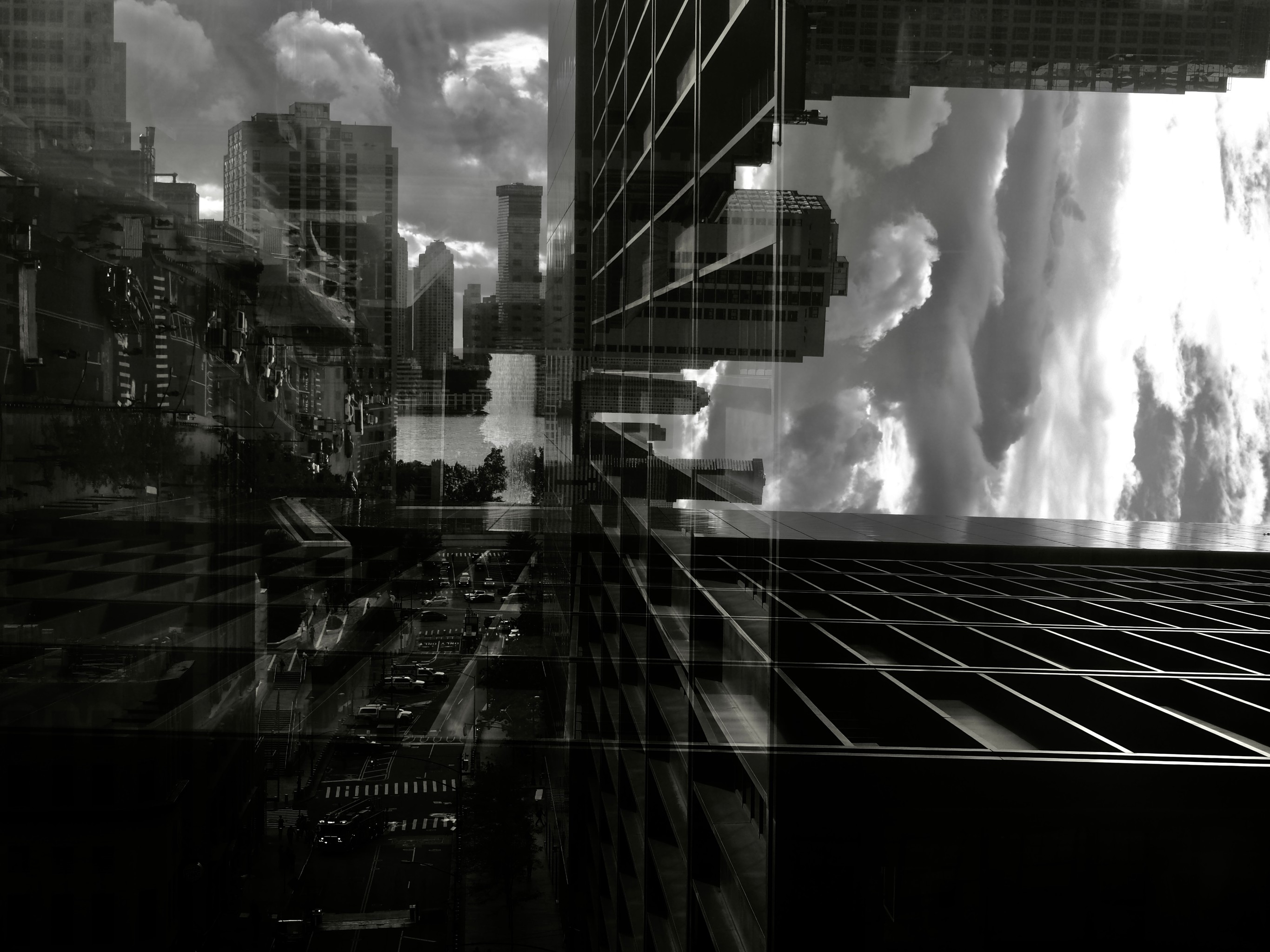
“Distorted Reality”
Why I liked it: Karen’s inception-like photo is a beautiful example of taking a simple concept of multiple exposure and creating a mind-bending reality scene. What I love the most is the high contrast of the edge light on the building, created by the overcast sun, as well as the striking processing into black and white. This photo is really enjoyable to look at and could definitely go on a wall.
Exif: Olympus E-PL7 · Olympus OLYMPUS M.14-42mm F3.5-5.6 EZ @31mm · 1/640 · ISO 200
Genre: Black & White, Architecture
Want to join us for the next photo challenge?
Click here to join 52Frames, it’s free!
Congratulations to those who were chosen. I really enjoy this new feature. It gives us another opportunity to get our photos seen by a wider audience. My only quibble is that two of the five photos you chose to feature here are in the top three this week. I feel like this is redundant. Getting in the top three is it’s own honor, and the special five featured photos shouldn’t be the same exact photos. Honestly, I don’t think they should be in 52Picks either, just to give someone else an opportunity to feel like their work is valuable to the group. Just my two cents worth.
Hey Kim, I hear you but there was only one photo here that was in the top three. That top image is just the cover photo of the album, which I didn’t discuss in this blog post. While I try to not include the top three photos, I’m also just trying to be true to myself in expressing the photos that I really liked in the album and why. Sometimes there will be overlap and I feel that will make this blog more authentic and easy for me to do.
I think there’s also value in me expressing why a top three photo resonated with me or even why I chose it, with Susan for that matter. There is the other side of that coin.
I totally hear you and I will try and skew more to photos that were not featured in the top three but no promises 😊
I appreciate reading your insights on the images you chose here regardless of their ‘ranking’ as I think it helps see why they may have been chosen in the other categories. I personally was shocked that my blue hour image, which was a “last minute and I’m too lazy to change my lens” shot was noticed. I know how difficult it is to look at so many images each week and whittle it down. I struggle with whittling my own. Thank you for this platform.